
DAPPA Clip: Virtual try-on Chrome extension, powered by AI.
DAPPA Clip, is a Chrome extension designed to streamline online clothing purchases with virtual try-on, price tracking, and sizing suggestions. Leading a small design team, I had a impactful role that shaped product direction, and created key features whilst adapting to pivots. DAPPA shortly shutdown due to Google's AI try-on market entry.
DAPPA Clip, is a Chrome extension designed to streamline online clothing purchases with virtual try-on, price tracking, and sizing suggestions. Leading a small design team, I had a impactful role that shaped product direction, and created key features whilst adapting to pivots. DAPPA shortly shutdown due to Google's AI try-on market entry.
My role
Lead UI designer working with cross functional team of developers and growth marketers.
Timeline
Feb 2024 - May 2025 (1yr 4mos)
Feb 2024 - May 2025
(1yr 4mos)
Impact
+900% in active users within the 1st week (~150 → 1.5K+) due to redesign of product.
Robust UX research reduced re-dos and pivots, cutting "idea to live" time by 25%
(~2 months → ~1.5 months) boosting overall efficiency.
Model upload completion time decreased by 55% (1m 22s → 37s), with the screen reduced from 28 → 8 pages.
Increased SUS score [70/100 → 80/100], CSAT [2/5 → 3/5], and NPS [2/5 → 3/5].
Established a design system and workflow that boosted work efficiency by +30%.
My role
Lead UI designer working with cross functional team of developers and growth marketers.
Timeline
Feb 2024 - May 2025 (1yr 4mos)
Impact
+900% in active users within the 1st week (~150 → 1.5K+) of newly designed DAPPA Clip.
Robust UX research reduced re-dos and pivots, cutting "idea to live" time by 25%
(~2 months → 1.5 months) boosting overall efficiency.
Model upload completion time decreased by 55% (1m 22s → 37s), with the process shortened from 28 → 8 pages.
Increased SUS score [70/100 → 80/100], CSAT [2/5 → 3/5], and NPS [2/5 → 3/5].
Established a design system and workflow that boosted work efficiency by +30%.
PROBLEM
For online shoppers, confusion and uncertainty are common when deciding on a purchase, often regretting it later.
Online shopping, meant to be recreational and fun often brings confusion, uncertainty and regret. Why? How can DAPPA solve this stressful experience?
Online shopping, meant to be recreational and fun often brings confusion, uncertainty and regret. Why? How can DAPPA solve this stressful experience?
SOLUTION
Virtual try-on and smart product & price tracking are pivotal in building purchasing confidence.
1. Virtual try-on & suggested sizing
Outfit Experimentation - Virtually try-on clothes to build confidence
Outfit History - Access previous outfit generations for comparison that helps decision making.
Smart Sizing - Automatic recommendations reducing uncertainty
Outfit Experimentation - Virtually try-on clothes to build confidence
Outfit History - Access previous outfit generations for comparison that helps decision making.
Smart Sizing - Automatic recommendations reducing uncertainty
2. Simplified wishlist
Centralised hub – No more scattered links, easily trace back to original URL.
Smarter shopping - Price updates and seasonal special notifications.
Quick previews - Find past try-ons to help purchasing decision.
Centralised hub – No more scattered links, easily trace back to original URL.
Smarter shopping - Price updates and seasonal special notifications.
Quick previews - Find past try-ons to help purchasing decision.

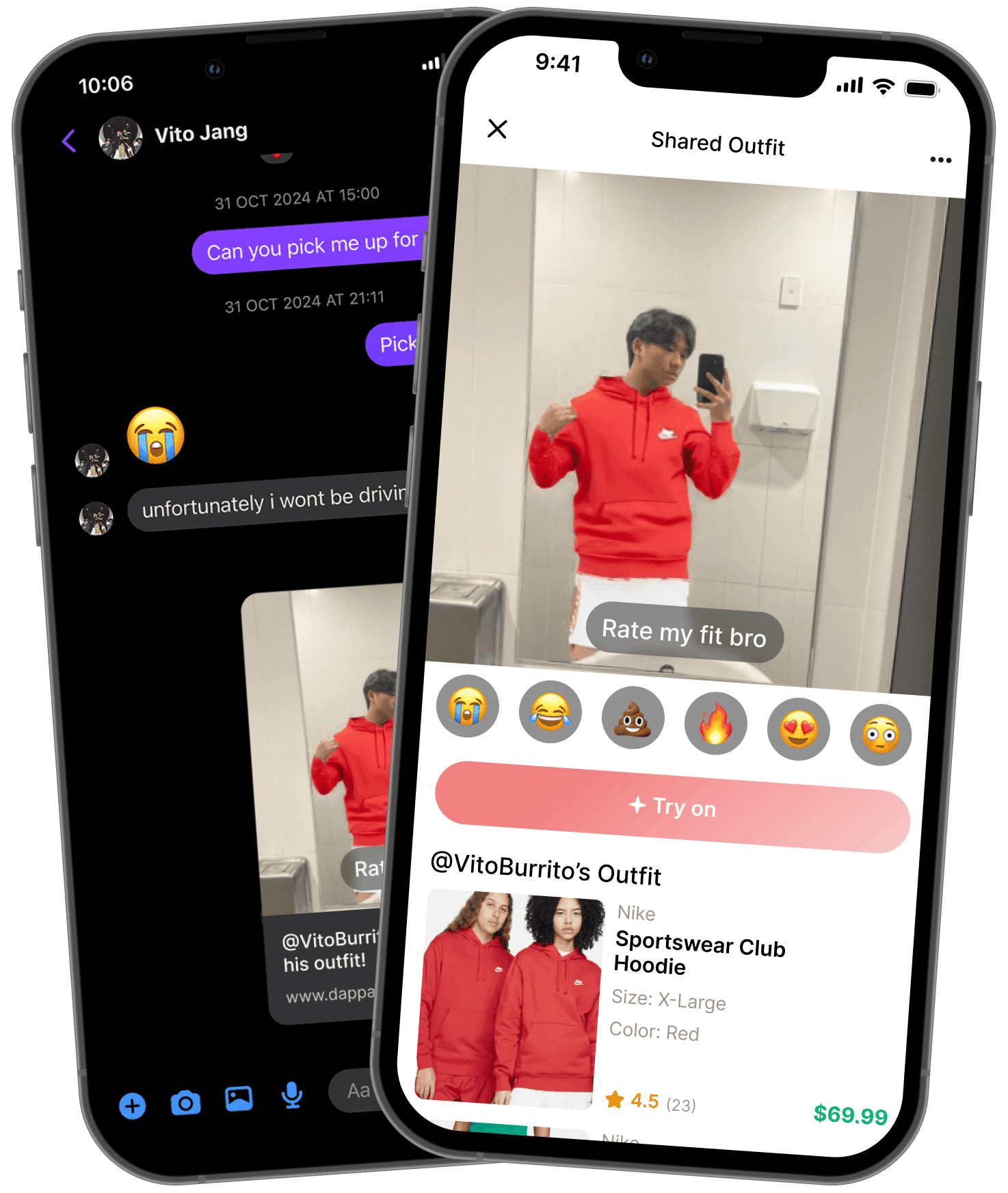
3. Share try-ons with friends
Validation & Engagement: Rating system provides social validation, reduces decision fatigue, and adds social interaction.
Fun Feedback: Emojis offer easy, humorous outfit feedback.
User Acquisition: Attracts new users, boosting the user base and retention.
Validation & Engagement: Rating system provides social validation, reduces decision fatigue, and adds social interaction.
Fun Feedback: Emojis offer easy, humorous outfit feedback.
User Acquisition: Attracts new users, boosting the user base and retention.
Fast track your review?
Fast track your review?
Skip Research Fluff
Skip Research Fluff
Skip Research Fluff
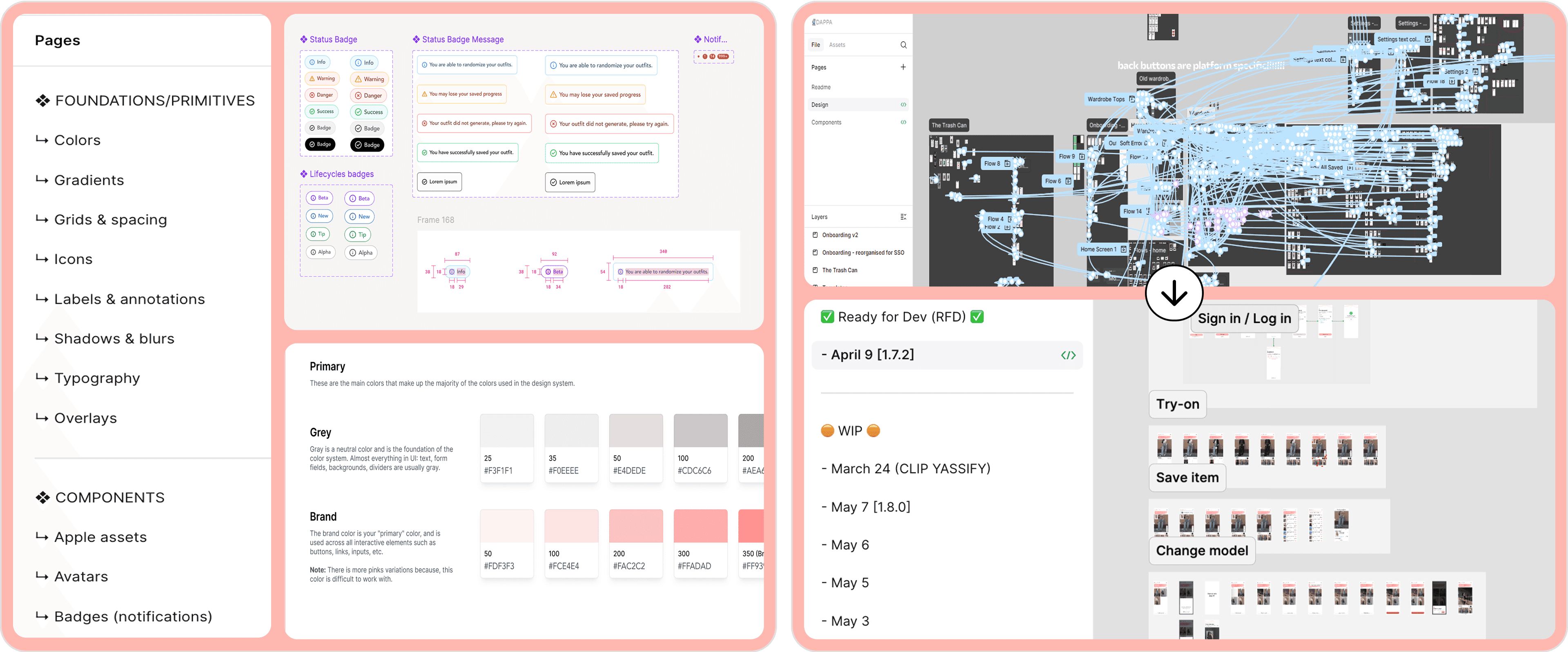
DESIGN SYSTEM + FILE MANAGEMENT
No design system = inconsistencies. I established a structured design work flow.
I built a comprehensive design system that streamlined collaboration, reduced confusion during handoff, and cleaned up files structure.
I built a comprehensive design system that streamlined collaboration, reduced confusion during handoff, and cleaned up files structure.
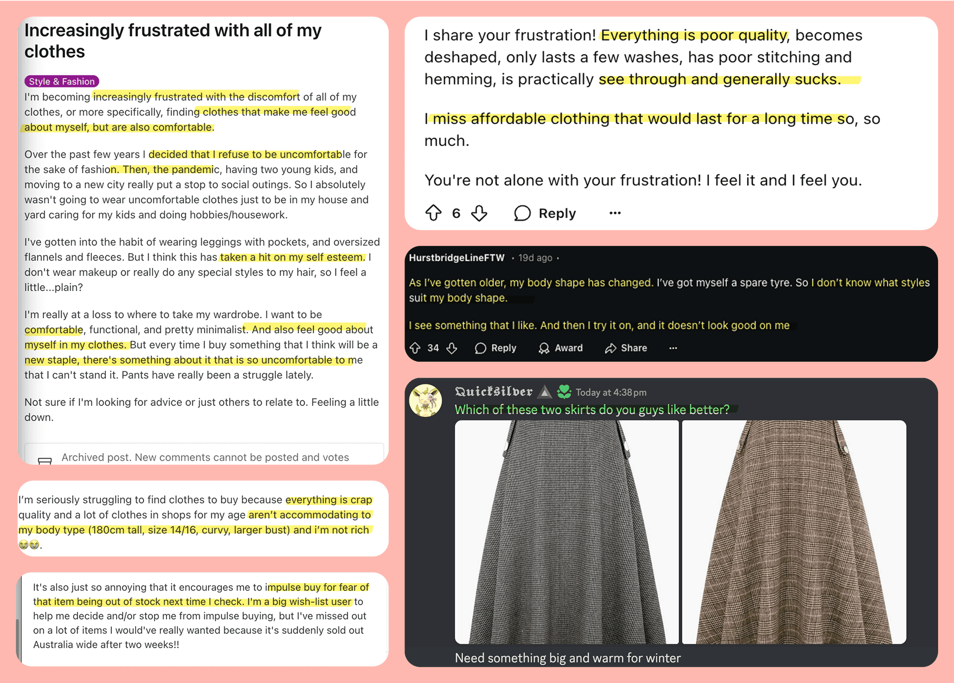
ONLINE ETHNOGRAPHY + SECONDARY RESEARCH
Body shape uncertainty and ill-fitting clothes crush self-esteem, people also highly value external validation.
Online research (r/AusFemaleFashion) revealed users struggle with comfortable, fitting clothing and evolving style, alongside a strong need for external outfit opinions for confidence.
Online research (r/AusFemaleFashion) revealed users struggle with comfortable, fitting clothing and evolving style, alongside a strong need for external outfit opinions for confidence.
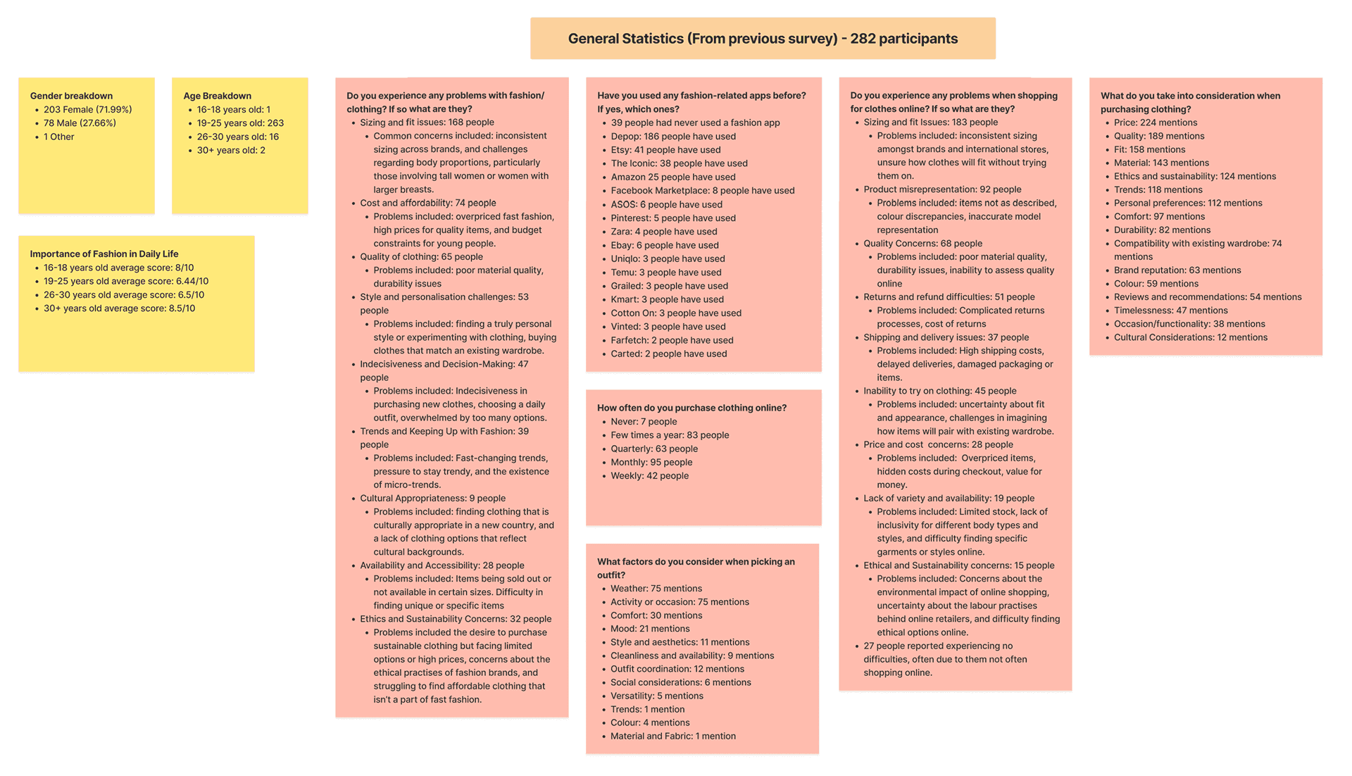
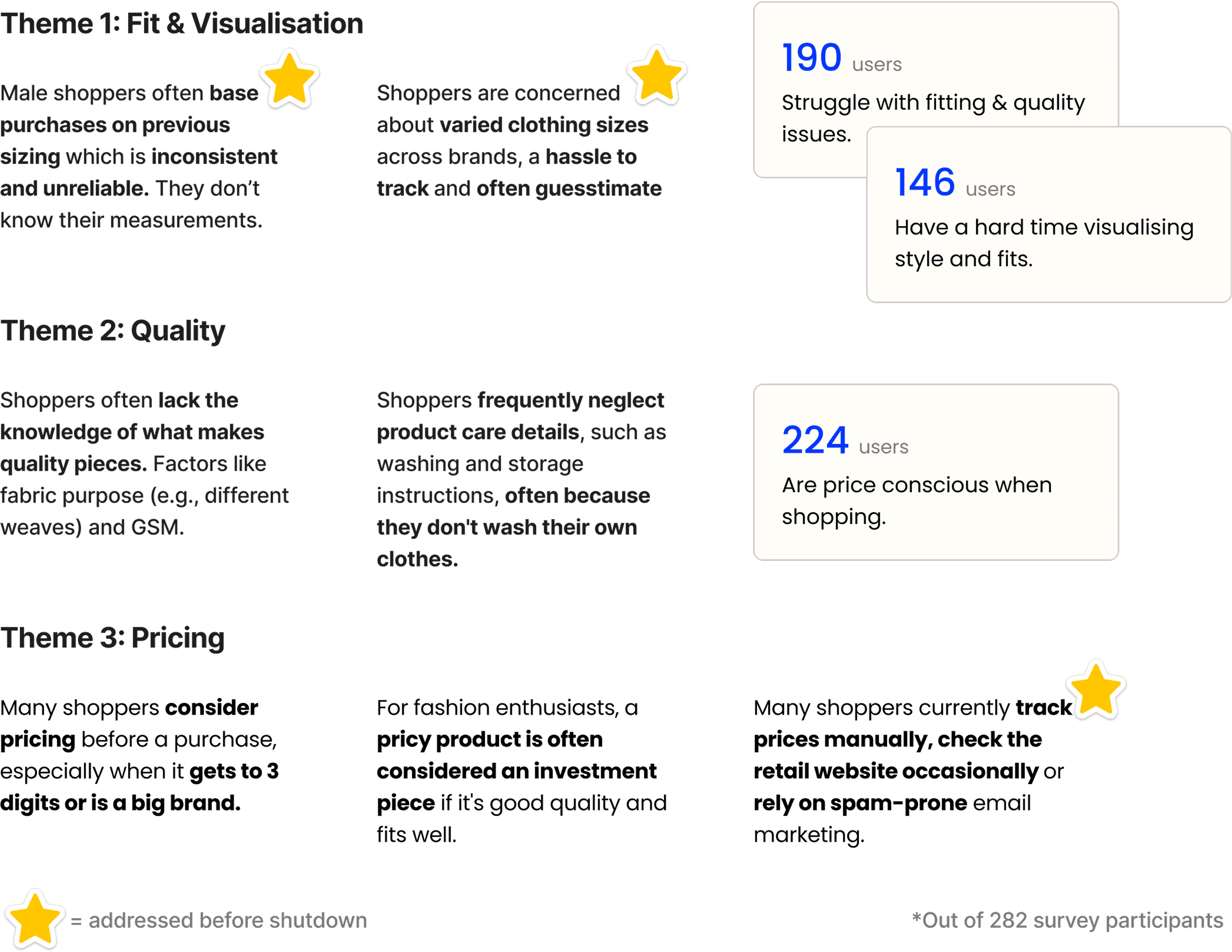
SURVEYS + INITIAL INTERVIEWS + AFFINITY MAPPING
Users prioritise price, quality, fit, and product visualisation above other factors when making purchasing decisions.
Interviews and surveys revealed 8 key user pain points when shopping:
Interviews and surveys revealed 8 key user pain points when shopping:
Finding inspiration
Pricing fixation
In-store changing rooms
Sustainability concerns
Finding inspiration
Pricing fixation
In-store changing rooms
Sustainability concerns
Social validation and self-confidence
Personal wardrobe understanding
Body type
Indecisiveness.
Social validation and self-confidence
Personal wardrobe understanding
Body type
Indecisiveness.
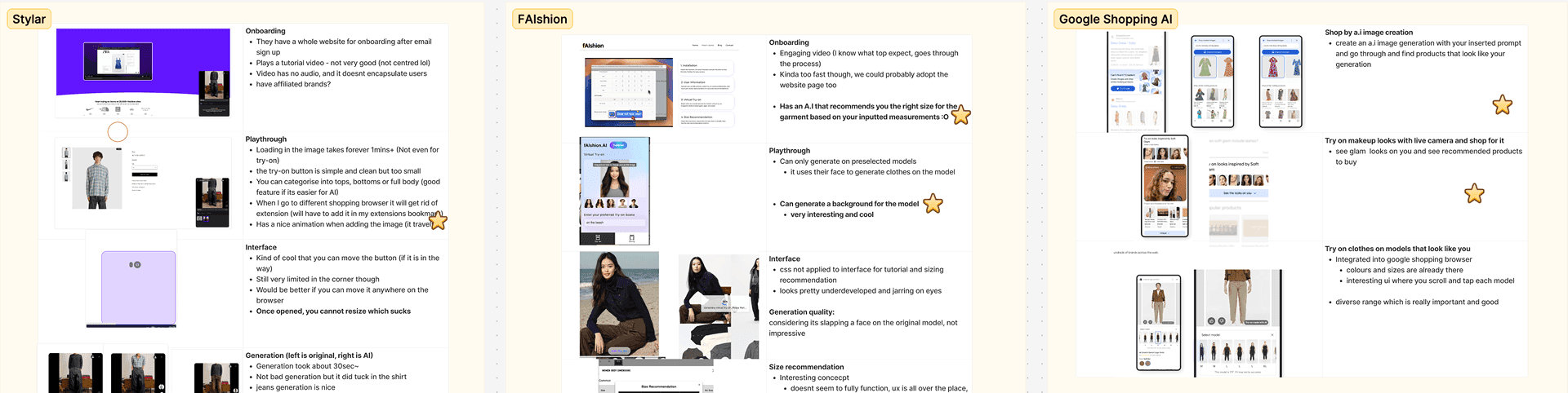
COMPETITOR ANALYSIS
Competitors lack product tracking, social features, and sizing guides.
We researched design trends, capabilities within the extension ecosystem and top competitors:
Stylar (for try-on quality and mix-and-match, despite bugs/slowness)
fAIshion (for size recommendations)
Google Shopping AI (for try-ons on stock models).
We researched design trends, aesthetics, and capabilities within the extension ecosystem and top competitors offerings:
Stylar (for try-on quality and mix-and-match, despite bugs/slowness),
fAIshion (for size recommendations)
Google Shopping AI (for try-ons on stock models).
MAIN INSIGHTS
Shoppers prioritise visual fit and quality, often investing in "grail" pieces.
Online shopping is often “unenjoyable, overwhelming, and confusing,” and perceived as "constant consumption that burns money,” leading to indecision, dissatisfaction (due to poor fit/quality), and frustrating returns. However, price becomes less critical when fit and quality are assured, especially with the rise of ethical shopping and the rejection of fast fashion among Millennials and Gen Z.
Online shopping is often “unenjoyable, overwhelming, and confusing,” and perceived as "constant consumption that burns money,” leading to indecision, dissatisfaction (due to poor fit/quality), and frustrating returns. However, price becomes less critical when fit and quality are assured, especially with the rise of ethical shopping and the rejection of fast fashion among Millennials and Gen Z.
How might we help users feel more confident before purchase and reduce online shopping regret by making it easier to understand and be informed about fit (visuals) and pricing?
How might we help users feel more confident before purchase and reduce online shopping regret by making it easier to understand and be informed about fit (visuals) and pricing?
How might we help users feel more confident before purchase and reduce online shopping regret by making it easier to understand and be informed about fit (visuals) and pricing?
PRIORITISATION MATRIX
MVP focus: price tracking, visualising product and social features.
With numerous identified problems, we prioritised core pain points through a cross-functional stakeholder workshop (front-end, back-end, PM, CEO, AI lead, designer) to ensure a focused product.
With numerous identified problems, we prioritised core pain points through a cross-functional stakeholder workshop (front-end, back-end, PM, CEO, AI lead, designer) to ensure a focused product.
Our strategy was to tackle technically feasible features that would maximise user value and traction, then scale for profit via generation credits, data sales, or advertisements.
Our strategy was to tackle technically feasible features that would maximise user value and traction, then scale for profit via generation credits, data sales, or advertisements.
Our strategy was to tackle technically feasible features that would maximise user value and traction, then scale for profit via generation credits, data sales, or advertisements.

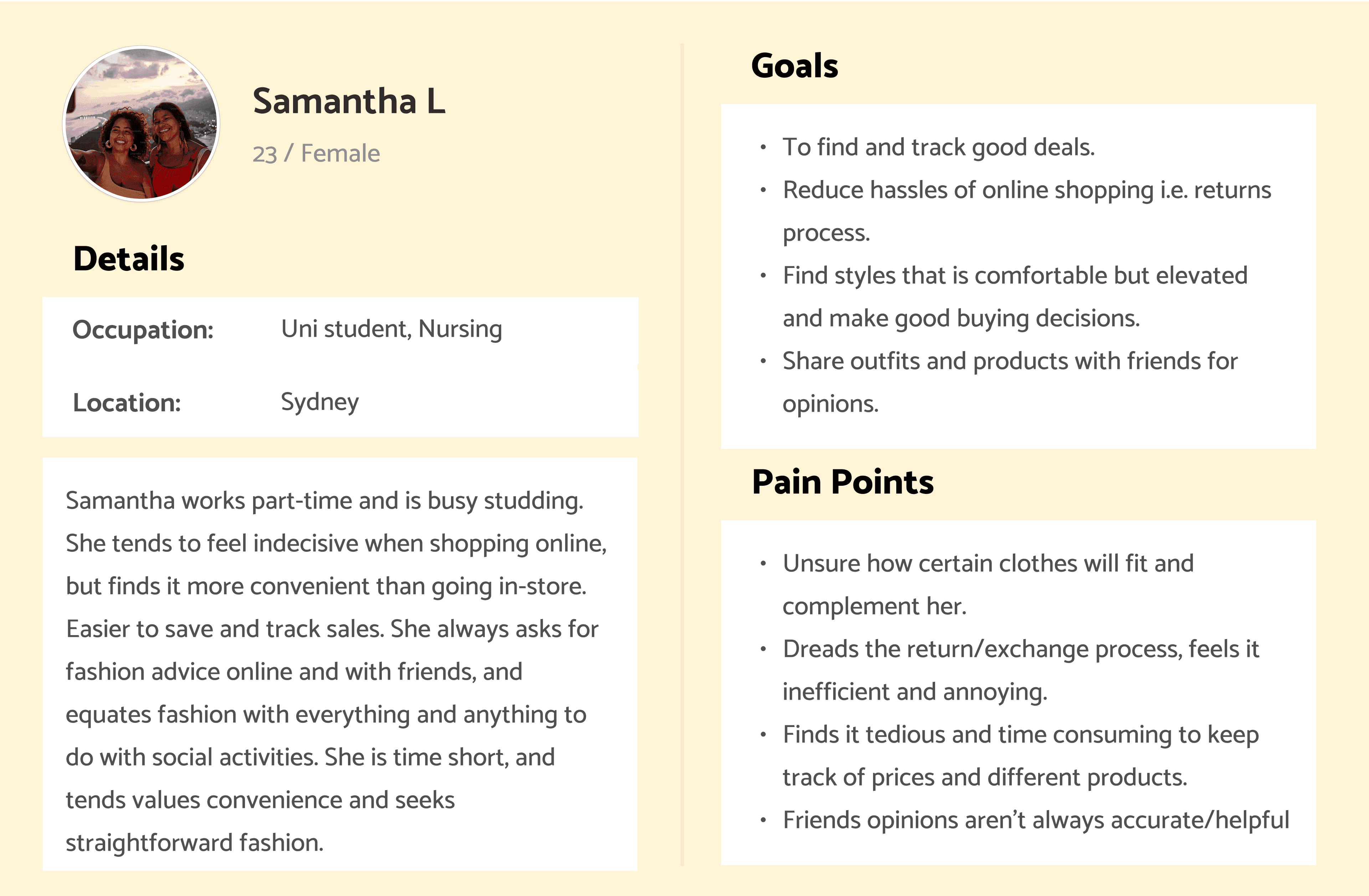
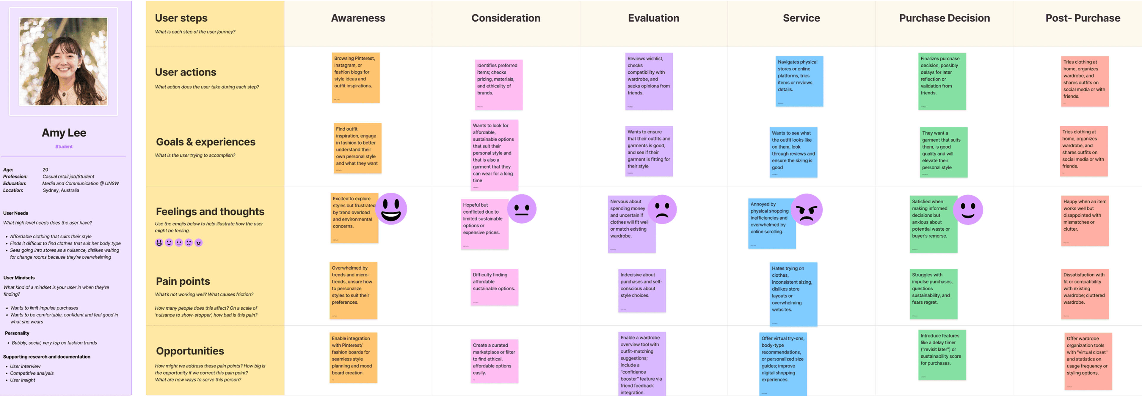
PERSONA + USER JOURNEY MAP
The decision-making process is draining, negatively affecting to user's cognitive load.
These artefacts guided the team's design decisions, illuminating the main struggles users faced throughout the buying process, from awareness to post-purchase.
These artefacts guided the team's design decisions, illuminating the main struggles users faced throughout the buying process, from awareness to post-purchase.
INTIAL DAPPA CLIP DESIGN
MVP: Price tracking, wishlist and outfit visualisation.
I designed this within 1 week working closely with developers, this MVP offered virtual try-on and price tracking with a simple, clean interface. Social features got pushed back due to technical barriers.
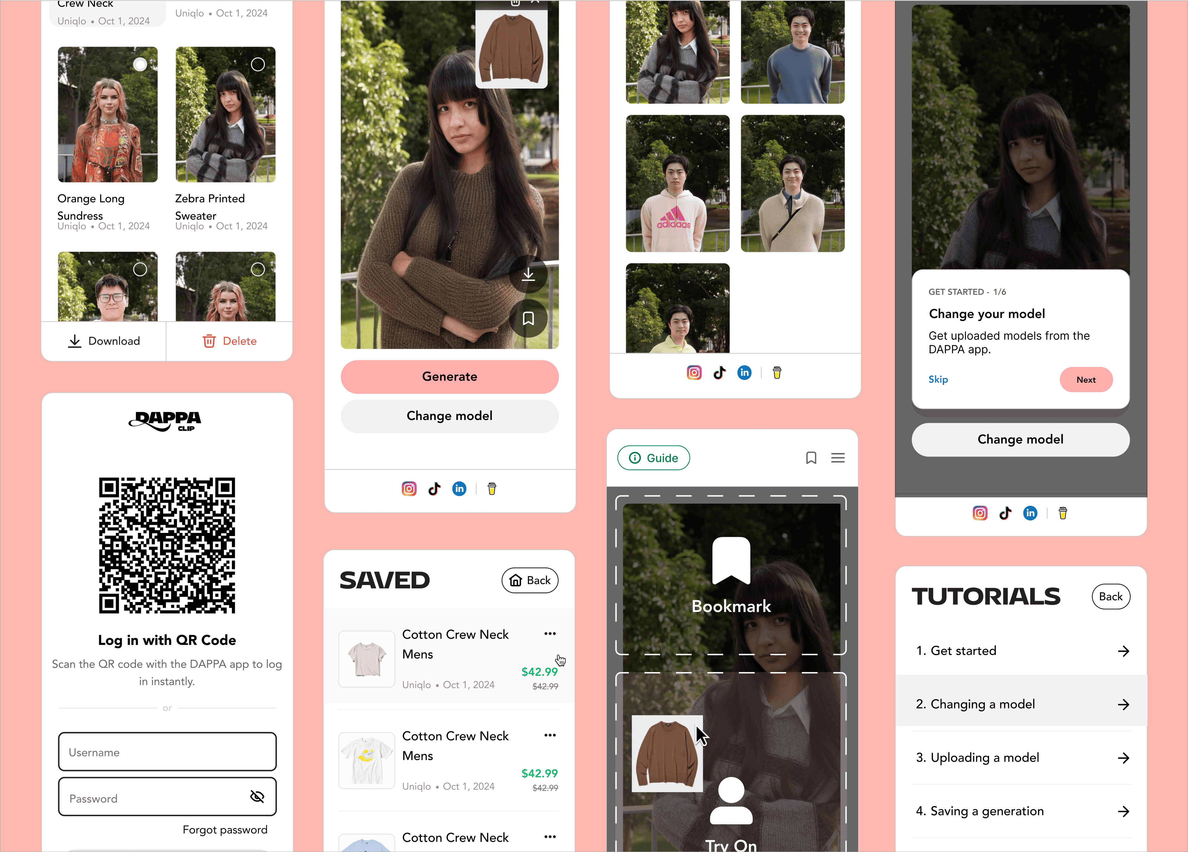
MVP TESTING RESULTS
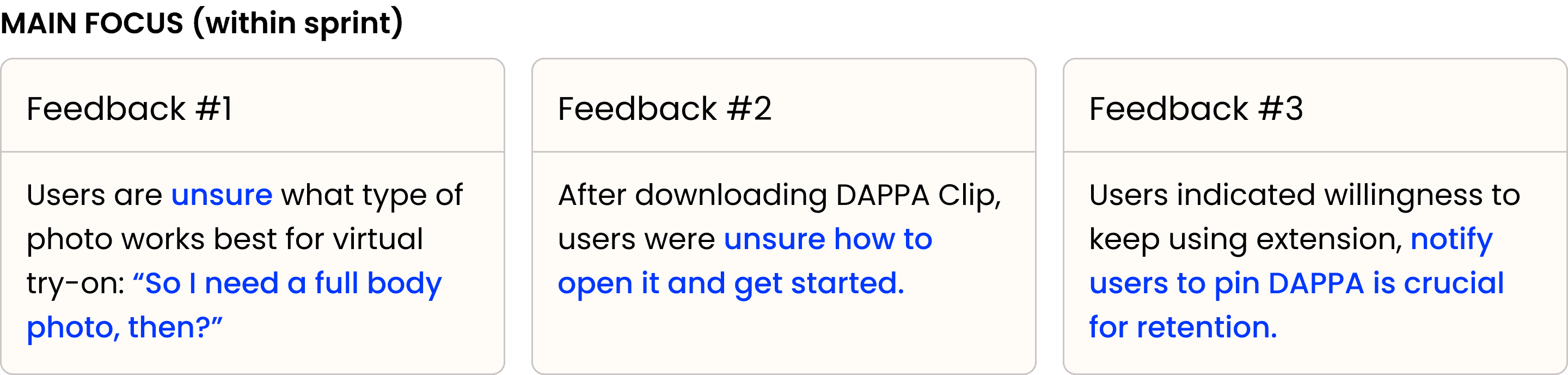
Users struggled with model upload and onboarding for DAPPA Clip.
Over 2 days, we tested the entire product flow with fashionable students and workers (aged 20-29). The core product received overall positive reactions, leading us to focus on creating a smoother onboarding process, get-started tips, and retention tactics.
Over 2 days, we tested the entire product flow with fashionable students and workers (aged 20-29). The core product received overall positive reactions, leading us to focus on creating a smoother onboarding process, get-started tips, and retention tactics.
IMPROVEMENTS
Swiched to desktop interface reducing sign-up time and confusion during model uploading.
"Feedback 1" and "Feedback 3" were addressed, but "Feedback 2" (tutorial filming/editing) remained incomplete due to the company's shutdown.
"Feedback 1" and "Feedback 3" were addressed, but "Feedback 2" (tutorial filming/editing) remained incomplete due to the company's shutdown.
1. Faster account creation
Desktop Transition: Utilised increased screen space for enhanced branding, and content
Enhanced Credibility: Adding more graphics made our service feel legitimate and chic.
Extension Pin Prompt: Enabled prompting users to pin the extension, addressing "Feedback #3."
Desktop Transition: Utilised increased screen space for enhanced branding, and content
Enhanced Credibility: Adding more graphics made our service feel legitimate and chic.
Extension Pin Prompt: Enabled prompting users to pin the extension, addressing "Feedback #3."
28 screens
5 screens
2. Streamlined model photo upload
Reduced screens: Shortened from 28 → 8 pages.
QR Scan: Photo upload was great affordance, integrating with browser onboarding.
Photo Instructions: Replaced lengthy tutorial video with shorter pictures and sentences.
Auto Camera with Signals: Designed a camera with red/green signals for improved photo capture, replacing manual timers.
Desktop Transition & Tutorials:
Utilised increased screen space for enhanced branding, content, and
integrated tutorial flows.Enhanced Credibility:
Added detail and logical flow made our service feel more legitimate and connected.Extension Pin Prompt:
Enabled prompting users to pin the extension, addressing "Feedback #1."
USABILITY TEST RESULTS
With a larger sample size and less bugs, even better outcomes are predicted.
1m 22s → 54s photo upload time
1m 22s → 54s
photo upload time
34% decrease in photo upload decision time and 9/10 users uploads adhered to written criteria demonstrated reduced confusion and guessing.
34% decrease in photo upload decision time and 9/10 users uploads adhered to written criteria demonstrated reduced confusion and guessing.
70/100 → 80/100 SUS increase
70/100 → 80/100
SUS increase
While it may seem like a small jump, this increase suggests users found the system notably easier to use, more consistent, and generally more pleasant.
While it may seem like a small jump, this increase suggests users found the system notably easier to use, more consistent, and generally more pleasant.
2/5 → 3/5 AVG CSAT score
2/5 → 3/5
AVG CSAT score
Slight improvement in CSAT, though still lower than expected likely due to unoptimised AI-generated results, UI bugs, and missing visuals that were cut from the sprint.
Slight improvement in CSAT, though still lower than expected likely due to unoptimised AI-generated results, UI bugs, and missing visuals that were cut from the sprint.
2/5 → 3/5 AVG NPS increase
2/5 → 3/5
AVG NPS increase
Higher NPS suggests UI/UX improved enough for users to recommend DAPPA Clip, but missing features show the product still needs refinement.
Higher NPS suggests UI/UX improved enough for users to recommend DAPPA Clip, but missing features show the product still needs refinement.
“Guys, this is really fun... like dress up Barbie on a computer.”
“Guys, this is really fun... like dress up Barbie on a computer.”
“I feel happy and joyous. I feel like, wow... interesting, I can see how it looks.”
“I feel happy and joyous. I feel like, wow... interesting, I can see how it looks.”
“Just drag and drop, saving. Yeah, not overwhelming. I felt like it was pretty easy.”
“Just drag and drop, saving. Yeah, not overwhelming. I felt like it was pretty easy.”
CHALLENGES
Start-to-end: adapting to volatility in a startup.
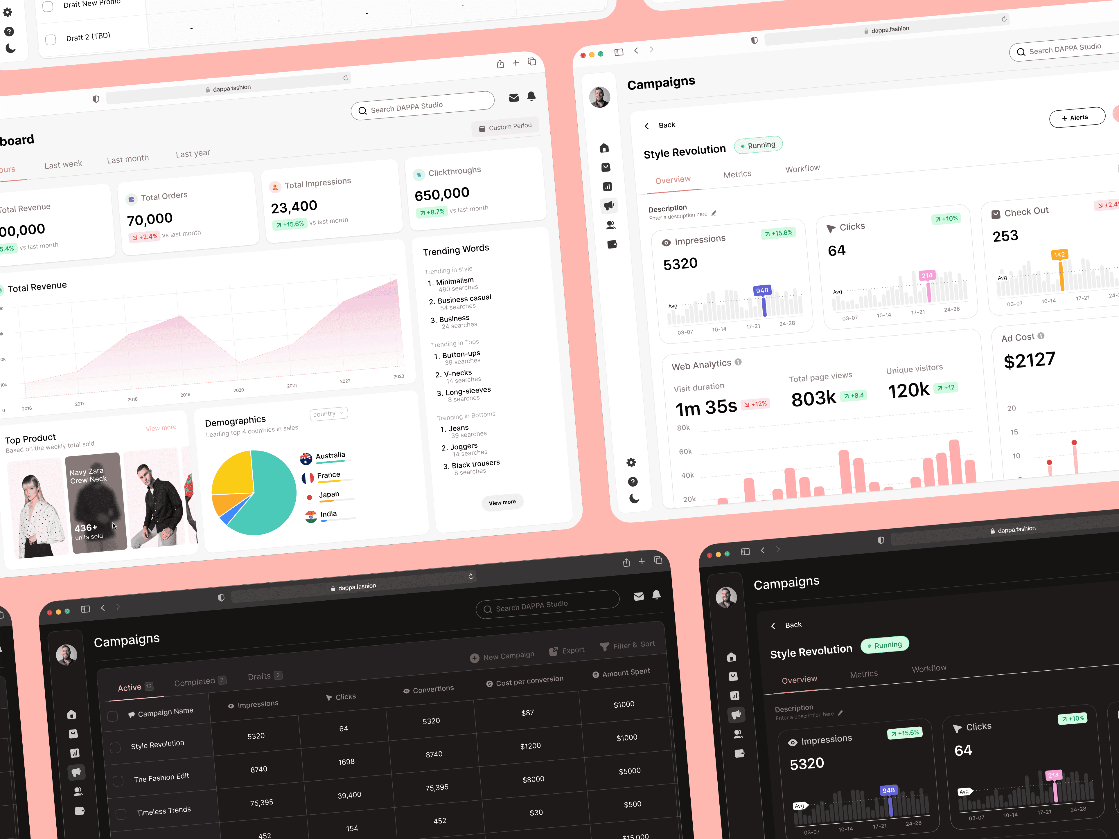
Project 1 - B2B Dashboard
CHALLENGE
Being B2B, we lacked leverage; we needed to create an irresistible offer for retailers and investors.
Being B2B, we lacked leverage; we needed to create an irresistible offer for retailers and investors.
SOLUTION
Dashboard to track popular/trending items, providing sales data and retailer trend analysis.
Dashboard to track popular/trending items, providing sales data and retailer trend analysis.
RESULT
B2B third-party dependence led to meagre returns, prompting a pivot to a B2C model.
B2B third-party dependence led to meagre returns, prompting a pivot to a B2C model.
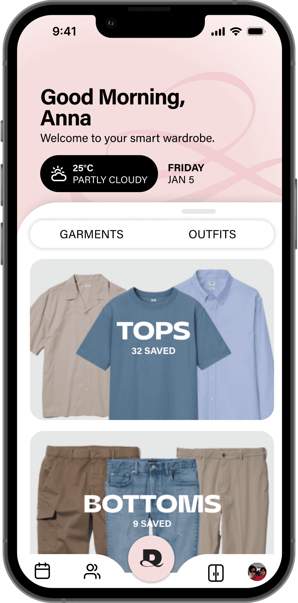
Project 2 - Revamping the wardrobe page
CHALLENGE
Wardrobe was confusing users, acting as a second homepage and clashing with the try-on page.
Wardrobe was confusing users, acting as a second homepage and clashing with the try-on page.
SOLUTION
Removed distractions, tweaked layout, and made navigation clearer, prioritising simplicity
Removed distractions, tweaked layout, and made navigation clearer, prioritising simplicity
RESULT
The wardrobe lacked retention, didn't align with company values due to existing similar apps.
The wardrobe lacked retention, didn't align with company values due to existing similar apps.
Project 3 - Explore shop
CHALLENGE
Low user retention stemmed from tedious wardrobe uploads and a clunky try-on experience, coupled with a slow monetisation model.
Low user retention stemmed from tedious wardrobe uploads and a clunky try-on experience, coupled with a slow monetisation model.
SOLUTION
Seamless in-app product search and virtual try-on with immediate affiliate revenue.
Seamless in-app product search and virtual try-on with immediate affiliate revenue.
RESULT
Our shop's Google search integration produced irrelevant, low-quality, and uninspiring product results misaligned with user fashion interests.
Our shop's Google search integration produced irrelevant, low-quality, and uninspiring product results misaligned with user fashion interests.
CONCLUSIONS + LESSONS LEARNED
What I’d do differently next time.
My 2 year time at a DAPPA was a rollercoaster of experiences. Offering invaluable, hands-on lessons that only a real world environment can provide.
My 2 year time at a DAPPA was a rollercoaster of experiences. Offering invaluable, hands-on lessons that only a real world environment can provide.
Learn Business Acumen: Pivots often signal issues with business models, strategy, or market fit. As a designer, it's crucial to understand the broader business to inform design decisions and adapt.
Balance UI & UX equally:
A great product is both functional and beautiful. Strive for seamless user flows (UX) and an intuitive, appealing interface (UI).
Lack of Design Team Diversity: The team had varied experience and lacked overall skill diversity, with a skew towards UI-focused designers.
Balance UI & UX equally:
A great product is both functional and beautiful. Strive for seamless user flows (UX) and an intuitive, appealing interface (UI).
Utilizing AI tools to speed up research/testing: We usually got <8 usability testers in a day. Using AI-driven online surveys could deliver similar insights faster and more efficiently. Also allocating more days would of made results more substantial.
Using more AI tools to speed up research/testing:
We usually got <8 usability testers in a day. Using AI-driven online surveys could deliver similar insights faster and more efficiently.
Prioritise Iteration & User Testing: Invest in more research resources to maximise results and reduce wasted effort. Also, continuously test and refine designs, especially in lo-fi stages, to catch flaws early and improve usability.
Neglecting Iteration and User Testing:
Continuously test and refine designs with users to catch flaws early and improve usability. Testing in the lo-fi stages could also reduce wasted efforts.
Balance UI & UX Equally: A great product is both functional and beautiful. I need to strive for seamless user flows (UX) and an intuitive, appealing interface (UI) by engaging in both types of work.
Balance UI & UX equally:
A great product is both functional and beautiful. Strive for seamless user flows (UX) and an intuitive, appealing interface (UI).
Insufficient research/validation: Validate more assumptions with users. Build products based on proven needs, not guesses. Though, in some cases it is fine to capture opportunities or if assumption has already been researched before.
Insufficient research/validation:
Validate more assumptions with users. Build products based on proven needs, not guesses.

