
Uniqlo: Modern Redesign w/ Easier Discovery & Smoother Navigation.
In this personal project, I set out to improve product discovery, simplify navigation, and boost user retention. Research revealed user frustration with UI elements and deeper shopping needs and facilitation.
In this personal project, I set out to improve product discovery, simplify navigation, and boost user retention. Research revealed user frustration with UI elements and deeper shopping needs and facilitation.
In this personal project, I set out to improve product discovery, simplify navigation, and boost user retention. Research revealed user frustration with UI elements and deeper shopping needs and facilitation.
My role
Personal project as the UI/UX designer
Personal project as the UI/UX designer
Timeline
Oct - Nov 2023 (2 weeks)
Oct - Nov 2023 (2 weeks)
Impact
Increased product search speed by +67%, 3x faster (1 m 32 s → 30 s).
Increased scroll depth by +40%, indicating better product discoverability.
All 8 users described the revamp as "refreshing, clean, and easy to browse."
The SUS score increased from 30/100 → 80/100.
My role
Personal project as the UI/UX designer
Timeline
Oct - Nov 2023 (2 weeks)
Impact
Increased product search speed by 67%, 3x faster (1 m 32 s → 30 s).
Increased scroll depth by 40%, indicating better product discoverability.
All 8 users described the revamp as "refreshing, clean, and easy to browse."
The SUS score increased from 30/100 → 80/100.
PROBLEM
Online shoppers struggle to find products, leading to frustration and transforming a pleasant experience into a chore.
As a loyal Uniqlo shopper, my enjoyment of their products was overshadowed by a frustrating and clunky website. It sometimes takes me ages to find what I’m looking for. This sparked my investigation: what makes their website so poor compared to competitors, and do others feel the same?
As a loyal Uniqlo shopper, my enjoyment of their products was overshadowed by a frustrating and clunky website. It sometimes takes me ages to find what I’m looking for. This sparked my investigation: what makes their website so poor compared to competitors, and do others feel the same?
As a loyal Uniqlo shopper, my enjoyment of their products was overshadowed by a frustrating and clunky website. It sometimes takes me ages to find what I’m looking for. This sparked my investigation: what makes their website so poor compared to competitors, and do others feel the same?
SOLUTION
A clean, personalised UI that guides users to their goals is key to a pleasant shopping experience.
1. User-centric landing page
Minimalist and uncluttered aesthetic creates a pleasant "breathable" experience.
Minimalist and uncluttered aesthetic creates a pleasant "breathable" experience.
Minimalist and uncluttered aesthetic creates a pleasant "breathable" experience.
Improved text and image accessibility by adjusting color contrast, font size, and layout.
Image focused communication decreases cognitive load.
Streamlined menu system
“Quick Access” lets users find products fast.
“Quick Access” lets users find products fast.
“Quick Access” lets users find products fast.
Streamlined categorisation enhances the shopping experience.
Shrunk menu improves ease of closing and visibility when mousing out of it.
Strategic colour use differentiates and emphasises for faster navigation.
Dynamic product grid view
Empowers users to tailor their product view for casual browsing or quick searches.
Empowers users to tailor their product view for casual browsing or quick searches.
Empowers users to tailor their product view for casual browsing or quick searches.
2-columns: Larger images let users appreciate each product fully.
3-columns: The default view balances item quantity with clear image viewing.
4-columns: Ideal for power users who want see more products at once.
2-columns: Larger images let users appreciate each product fully.
3-columns: The default view balances item quantity with clear image viewing.
4-columns: Ideal for power users who want see more products at once.
Outfit recommendations and user sizing guide
Minimalist aesthetic with ample white space creates a "breathable" design.
Improved text & image accessibility and via adjusting colour, font size, and layout.
Reduced visual clutter, and communication is primarily visual to minimise reading.
Minimalist aesthetic with ample white space creates a "breathable" design.
Improved text & image accessibility and via adjusting colour, font size, and layout.
Reduced visual clutter, and communication is primarily visual to minimise reading.
Fast track your review?
Fast track your review?
Skip Research Fluff
Skip Research Fluff
Skip Research Fluff
NETNOGRAPHY + REVIEWS + FORUMS
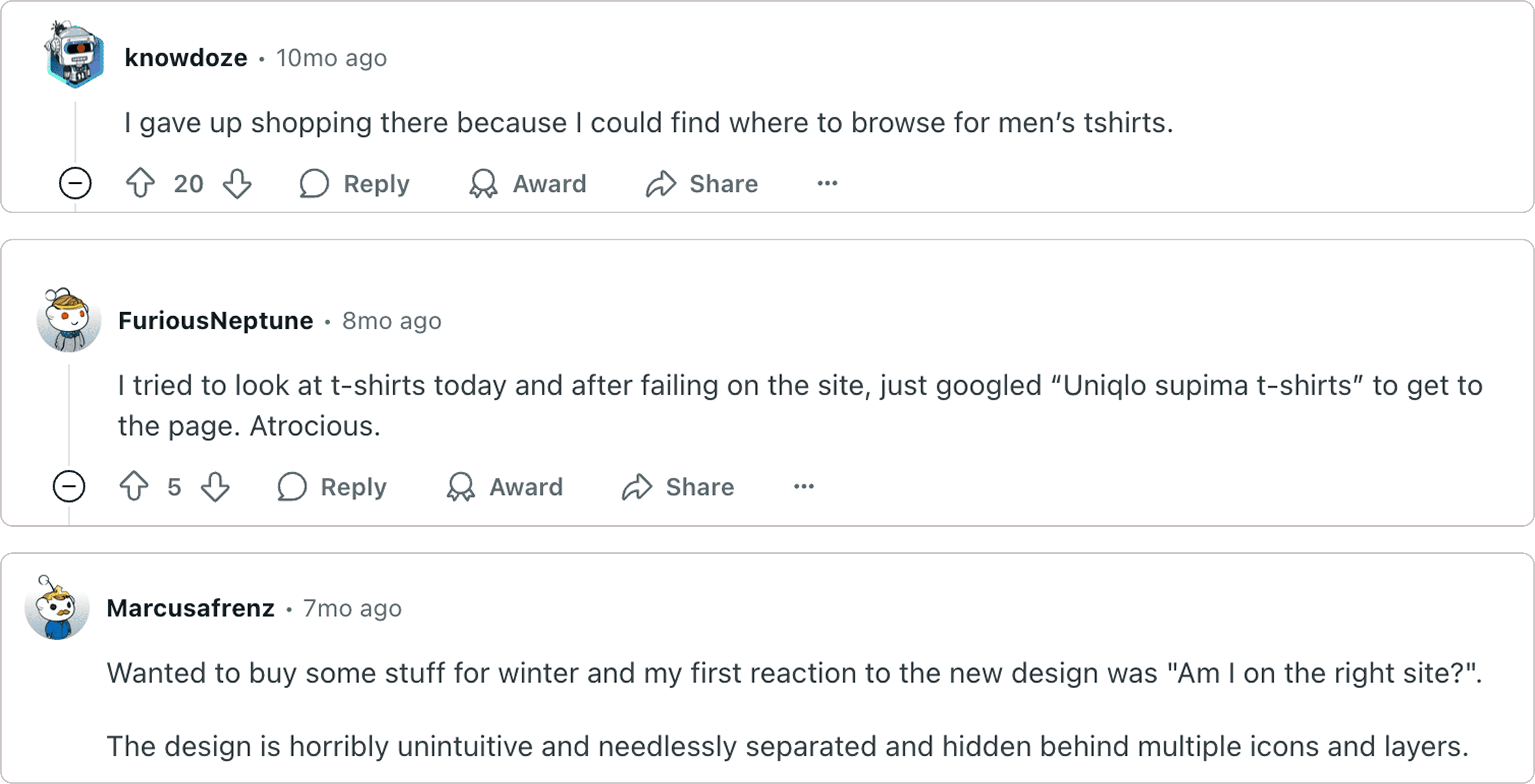
Searching for a product is unintuitive making it hard to find items.
Verified frustrations through online research, uncovering a lot of negative feedback on forums like r/Uniqlo. The biggest issues were related to finding products, confusing navigation and overall poor UI.
Verified frustrations through online research, uncovering a lot of negative feedback on forums like r/Uniqlo. The biggest issues were related to finding products, confusing navigation and overall poor UI.
Verified frustrations through online research, uncovering a lot of negative feedback on forums like r/Uniqlo. The biggest issues were related to finding products, confusing navigation and overall poor UI.
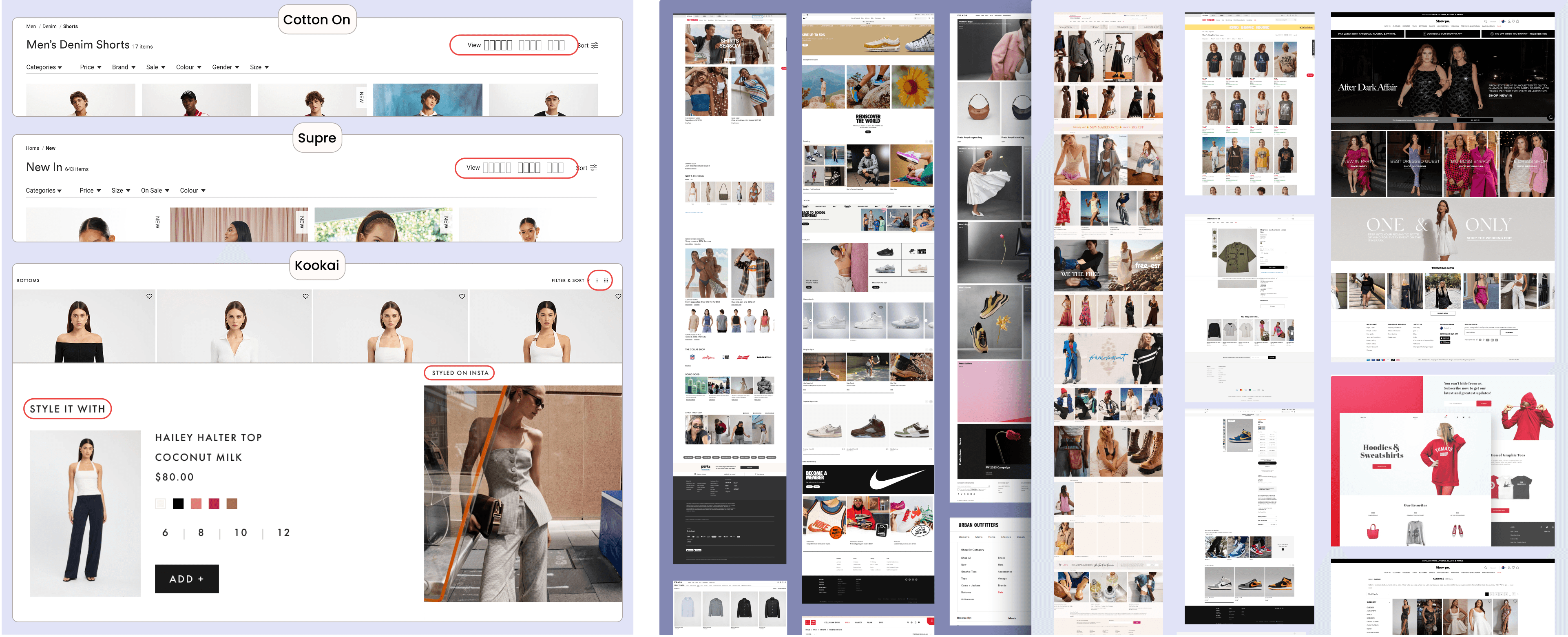
EXPLORING COMPETITORS
Competitors have clean simple design & offer features that tailor the shopping experience to user needs.
I analysed a wide range of competitor sites from Zara and Nike to luxury labels like Prada. This informed a visually refined redesign by drawing from the industry's best. Notably, a handful of brands used dynamic grid systems that felt both intuitive and effective.
I analysed a wide range of competitor sites from Zara and Nike to luxury labels like Prada. This informed a visually refined redesign by drawing from the industry's best. Notably, a handful of brands used dynamic grid systems that felt both intuitive and effective.
I analysed a wide range of competitor sites from Zara and Nike to luxury labels like Prada. This informed a visually refined redesign by drawing from the industry's best. Notably, a handful of brands used dynamic grid systems that felt both intuitive and effective.
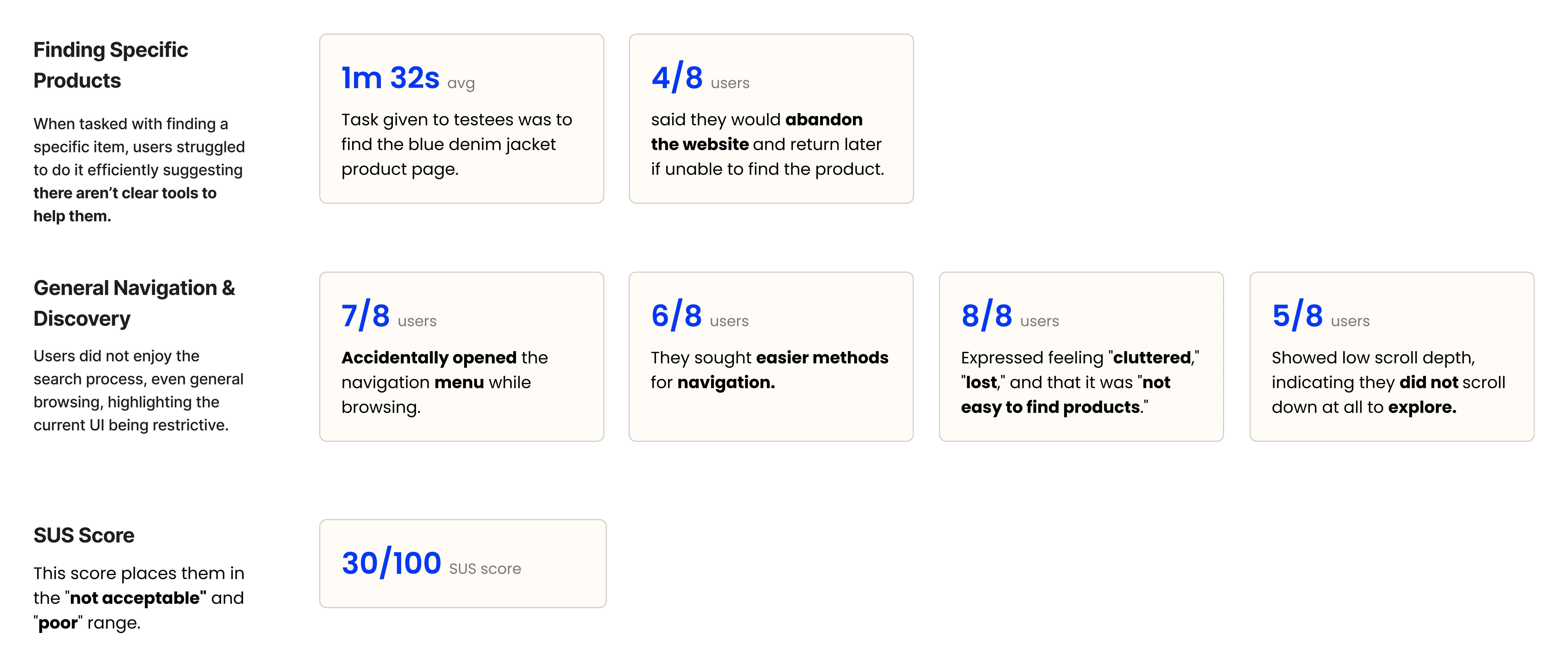
SHORT INTERVIEWS + UNSTRUCTURED TESTING + SUS
Users said it’s “a navigational maze,” and “could be easier.”
Initial interviews and unstructured testing quickly validated my hypotheses. I observed 8 Uniqlo shoppers struggle with navigation and product discovery when asked to find a denim jacket. Afterwards, I conducted follow-up interviews and SUS surveys to deepen insights.
Initial interviews and unstructured testing quickly validated my hypotheses. I observed 8 Uniqlo shoppers struggle with navigation and product discovery when asked to find a denim jacket. Afterwards, I conducted follow-up interviews and SUS surveys to deepen insights.
Initial interviews and unstructured testing quickly validated my hypotheses. I observed 8 Uniqlo shoppers struggle with navigation and product discovery when asked to find a denim jacket. Afterwards, I conducted follow-up interviews and SUS surveys to deepen insights.
Interview questions:
Interview questions:
How do you usually find things on the Uniqlo website?
What's your first thought about the website's look and feel?
Can you remember a time you couldn't find something? What happened?
Is it easy to just browse and discover new clothes on the site?
If you could change one thing about the website, what would it be?
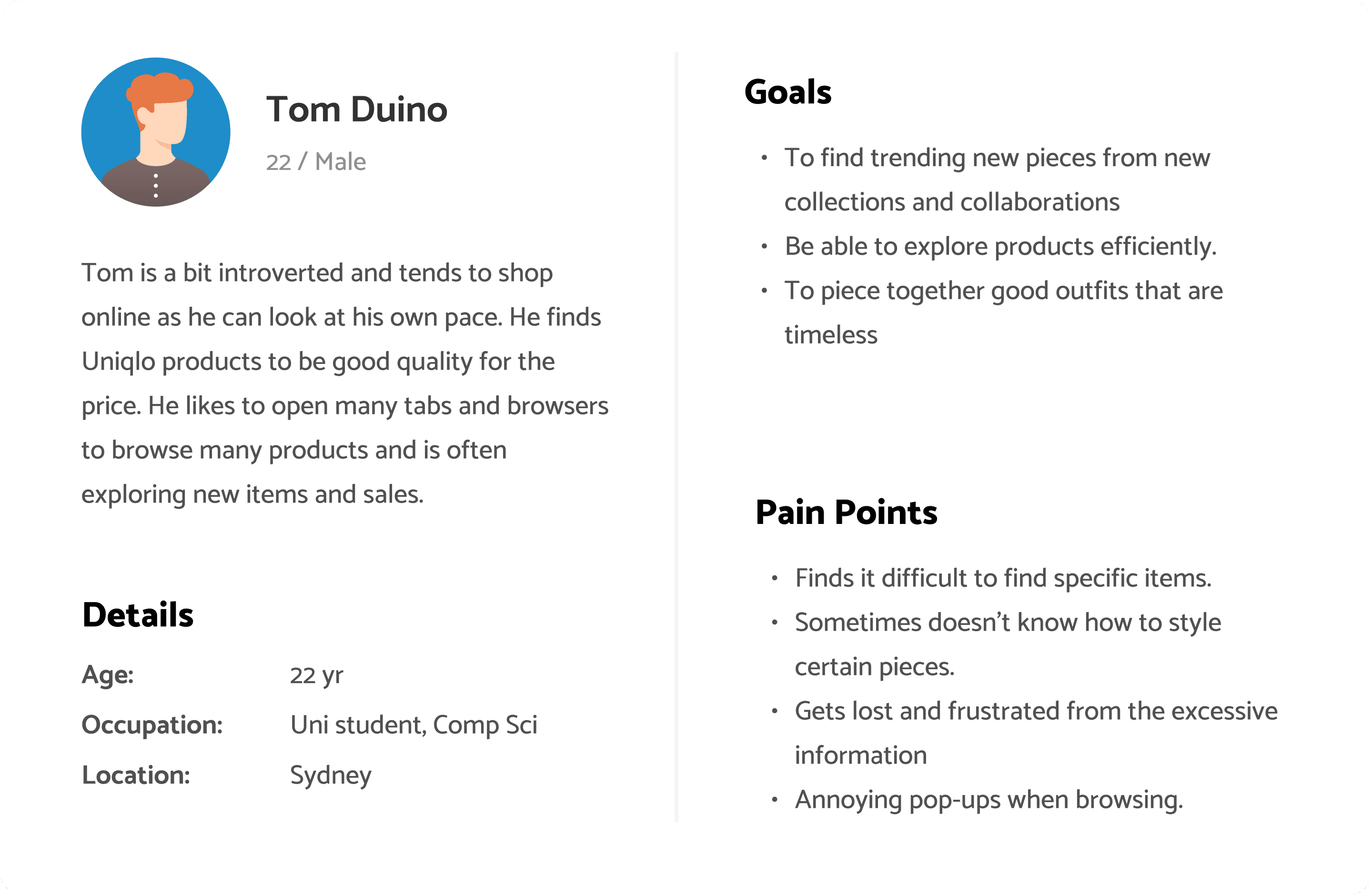
PERSONA
A shopper that seeks a seamless, guided, and personalised shopping experience.
I referred to this persona to guide my design decisions—someone who wants to be fashionable but often struggles to put outfits together, regularly browsing for new collections and specific items.
I referred to this persona to guide my design decisions—someone who wants to be fashionable but often struggles to put outfits together, regularly browsing for new collections and specific items.
RESEARCH MAIN INSIGHTS
Online shoppers feel lost in the UI - the bigger problem being poor product discovery, navigation and personalisation leaving people frustrated.
Shoppers often felt "lost in a maze" and “could be easier” turning the experience into a chore rather than a delight. Contributing issues included intrusive pop-ups, information overload, blurry images, hard-to-read text, and other easily fixable UI problems.
Shoppers often felt "lost in a maze" and “could be easier” turning the experience into a chore rather than a delight. Contributing issues included intrusive pop-ups, information overload, blurry images, hard-to-read text, and other easily fixable UI problems.
How might we reduce frustration, make product discovery effortless and delightful, and personalise the shopping journey to retain users?
How might we reduce frustration, make product discovery effortless and delightful, and personalise the shopping journey to retain users?
How might we reduce frustration, make product discovery effortless and delightful, and personalise the shopping journey to retain users?
WIREFRAMES + HEATMAPPING
I focused on proper hierarchy and a spacious layout for pleasant browsing experience.
I chose a free-flowing style with ample white space for better browsing experience, replacing the old slideshow style. A heatmap was used to ensure good visual hierarchy. I picked the middle option as it felt inline with Uniqlo's brand identity.
I chose a free-flowing style with ample white space for better browsing experience, replacing the old slideshow style. A heatmap was used to ensure good visual hierarchy. I picked the middle option as it felt inline with Uniqlo's brand identity.
SETBACK
Adding dark mode was based on an assumption that led to inconclusive results in the final design.
Dark mode being an industry standard, its inclusion here was based on assumptions of user desire rather than a validated need. This presented a challenge: ensuring its value beyond a "nice-to-have" feature.
Dark mode being an industry standard, its inclusion here was based on assumptions of user desire rather than a validated need. This presented a challenge: ensuring its value beyond a "nice-to-have" feature.
IMPROVEMENTS
The design was significantly elevated by 2 major improvements.
Based on several days of feedback from my 8 friends, I refined the initial designs over the span of the final few days of the set deadline.
Based on several days of feedback from my 8 friends, I refined the initial designs over the span of the final few days of the set deadline.
Solidified brand presence, added tools for navigation and discoverability.
Hero section - was refined with increased negative space, addressing a previously cramped feel. This enhanced visual hierarchy reinforces Uniqlo's minimalist brand, aiming for greater user engagement.
Quick Access - categories were placed directly below the hero. This addressed user navigation struggles by leveraging natural browsing patterns, reducing the time to find products and boosting potential conversions.
Explore section - was replaced with targeted promotional space. This move aimed to overcome its previous ineffectiveness, driving higher click-through rates, improving product discovery, and aligning strategically with marketing goals.
A dynamic product grid offering a new level of personalisation and smoother browsing.
Dynamic grid view - Added top-right buttons enabling 2, 3, or 4-column product grids.
Reduces frustration and boosting discoverability, ultimately increases engagement & matching competitor offerings.
Dynamic grid view - Added top-right buttons enabling 2, 3, or 4-column product grids.
Reduces frustration and boosting discoverability, ultimately increases engagement & matching competitor offerings.
USABILITY TEST RESULTS
Users described the redesign as "good," "useful," and "handy."
With the new design, I conducted another round of usability testing and SUS surveys to measure its impact on user experience improvement. Overall, positively received.
With the new design, I conducted another round of usability testing and SUS surveys to measure its impact on user experience improvement. Overall, positively received.
87.5% users
Used the “Quick Access” categories below the hero section boosting searching.
1m 32s → 30s searching speed
67% of users navigated to the products and found the denim jacket product in under 30s.
62.5% users
Used the product grid feature saying it was “good, useful, and handy”
100% users
Users agreed the new design felt “refreshing, clean, and easy to browse.”
62.5% users
Used the product grid feature saying it was “good, useful, and handy”
30/100 → 80/100 SUS score
30/100 → 80/100
SUS score
This places the new design in the "acceptable" and "excellent" range.
1m 32s → 30s
searching speed
67% of users navigated to the products and found the denim jacket product in under 30s.
3/8 → 7/8
scrolled exploration
133% increase in scroll depth skimming content of the landing page.
100% users
Users agreed the new design felt “refreshing, clean, and easy to browse.”
3/8 → 7/8 scrolled exploration
133% increase in scroll depth skimming content of the landing page.
CONCLUSIONS + LESSONS LEARNED
What I’d do differently next time.
This was one of my foundational UX/UI projects. Here are a few key lessons I learned:
This was one of my foundational UX/UI projects. Here are a few key lessons I learned:
This was one of my foundational UX/UI projects. Here are a few key lessons I learned:
Organise Figma Files Consistently - I learnt the importance of dedicating time to consistent file and component organisation throughout the entire project lifecycle. As neglecting it causes more work for the future.
Organise Figma Files Consistently -
I learnt the importance of dedicating time to consistent file and component organisation throughout the entire project lifecycle.
Embrace Iteration - My initial designs were rarely my best work. I discovered the value of iterating frequently and being willing to let go of original ideas if they weren't delivering.
Embrace Iteration -
My initial designs were rarely my best work. I discovered the value of iterating frequently and being willing to let go of original ideas if they weren't delivering.
Probe for Deeper Insights - During interviews, I often encountered inconclusive answers. This taught me to probe deeper and ask follow-up questions to extract more meaningful information.
Probe for Deeper Insights -
During interviews, I often encountered inconclusive answers. This taught me to probe deeper and ask follow-up questions to extract more meaningful information.
Validate Assumptions and Prioritise - Validating assumptions and proper prioritisation is crucial; I learned that even seemingly intuitive features, like dark mode, may not be truly needed, highlighting the importance of thorough research to avoid wasted effort.
Validate Assumptions & Prioritise -
Validating assumptions and proper prioritisation is crucial; I learned that even seemingly intuitive features, like dark mode, may not be truly needed, highlighting the importance of thorough research to avoid wasted effort.

